

Krea 2 Editorial Spot Illustrations: Build a Cohesive Set
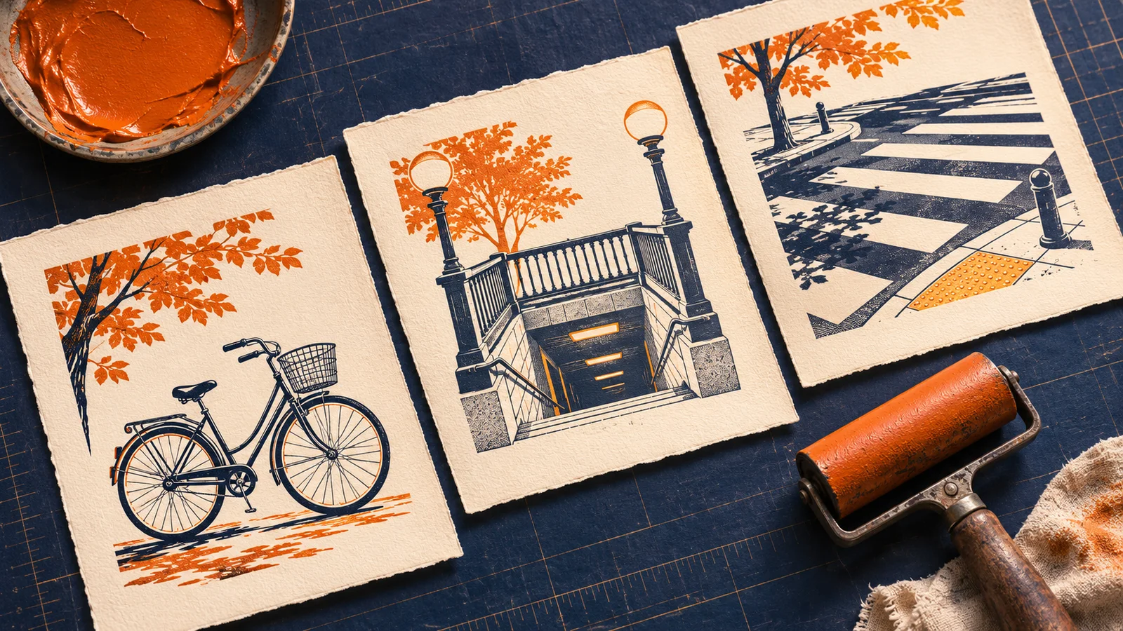
A bicycle, a subway entrance, and a pair of pedestrians can belong to the same newsletter without sharing a composition. For a set of editorial spot illustrations, keep a few visible style decisions fixed, then give each subject its own silhouette. Check the images together at the size readers will actually see.
Krea's Krea 2 prompting guide describes carrying a chosen visual treatment into new prompts with style references. The workflow below turns that idea into a three-image assignment. You can apply the written recipe in the Krea2 image workspace, using the model and generation controls shown there. It does not depend on a dedicated style slider.
Start with the placement
A spot illustration is a small image that accompanies text. It might sit beside a newsletter item or at the top of a short article. Its job is usually to identify an idea at a glance. A detailed street scene may look good on a large canvas but fail beside a headline if the bicycle is lost among storefronts and traffic.
Decide the placement before generating. For this example, imagine three equally sized cards in a city mobility newsletter. Each card needs one landscape illustration with room around the subject. The copy lives outside the picture. If you haven't chosen a treatment yet, start with Krea 2 creative exploration and approve one direction before building the series.
Write a style recipe another person could follow
Use a reference you can work with and describe the features you want to carry over. “Make it look like this” leaves the model to decide whether to repeat the linework, the colors, or the entire arrangement. In this example, a reference with a bicycle is useful for its ink and paper, but the bicycle itself should appear in only one card.
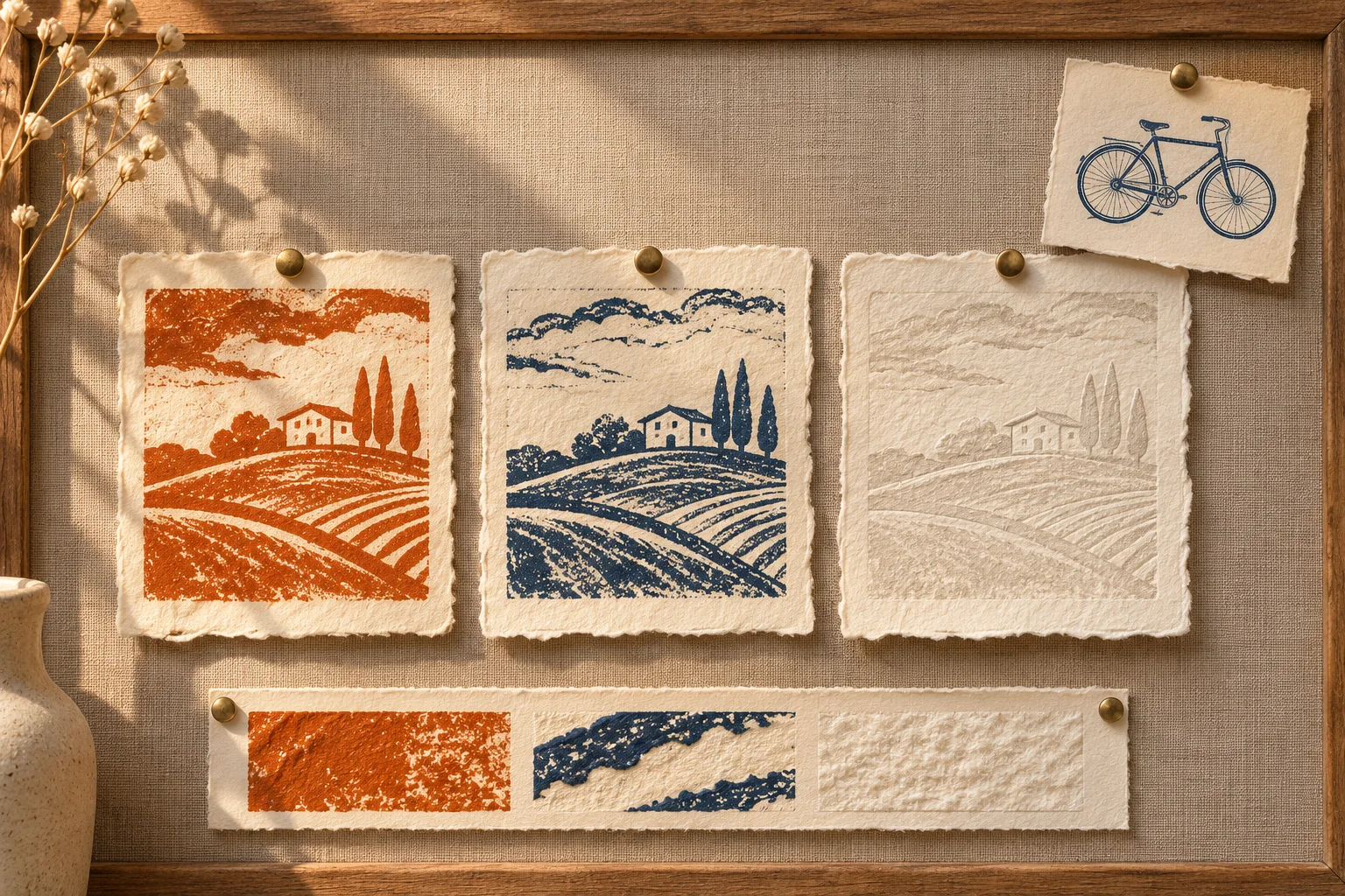
AI-generated concept illustration showing how a visual treatment can be separated from a subject.
Write a short recipe with visible constraints:
Use a hand-printed look on warm ivory paper. Draw the main shape in dark navy with slightly uneven edges and add one small burnt-orange accent. Keep background marks sparse, leave clear space around the subject, and add no lettering.
Keep the paper, line treatment, accent color, and detail level consistent. Let the camera angle and composition vary when that helps a subject read. A bicycle is often clearer from the side; a station stairwell may read better from the front. For help deciding what to borrow from a particular image, see the style reference guide.
Write one subject brief per card
Use Text-to-Image to try the written recipe. Keep the model and aspect ratio the same for the first pass so changes are easier to diagnose. If you are working with an image input, use Image-to-Image and explicitly say which visual traits to carry over. Image input can influence the subject or composition as well as the look, so start with the text recipe if the reference keeps introducing unwanted objects. Check the settings and any credit charge shown in the workspace before running a batch.
Keep the recipe unchanged and append one of these subject lines:
| Card | Subject line | What needs to read first |
|---|---|---|
| Cycling | Draw a city bicycle in side profile, with an orange front basket and an unobstructed frame. | Two wheels and a recognizable bicycle frame |
| Transit | Draw a subway stair entrance from the front, with navy railings and one orange lamp. | Steps descending between two rails |
| Walking | Draw two pedestrians crossing a few bold stripes, with one orange coat and no buildings. | Walking figures and a crosswalk |
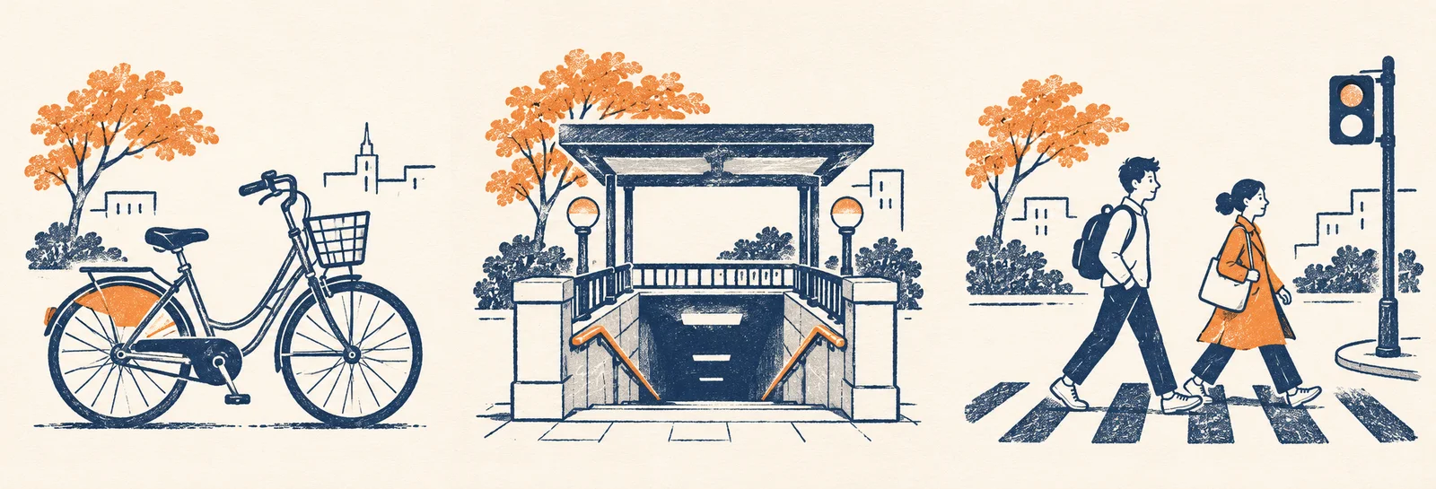
AI-generated concept examples. These illustrations show the intended family resemblance; they are not results from a Krea 2 test.
Generate each card separately if you need three independent files. A single triptych can help explain the art direction to a team, but it gives you less control over crop and spacing on each card. Approve one piece before producing the rest so there is a concrete example of how dense the ink and how small the accent should be.
Review the set at its real size
Place the three images beside the actual headlines or in a simple contact sheet. At thumbnail size, you should be able to identify each subject without its headline. At normal viewing size, compare the apparent line weight, paper color, and amount of orange. A repeatable accent should feel deliberate, but it does not need to sit in the same corner every time.
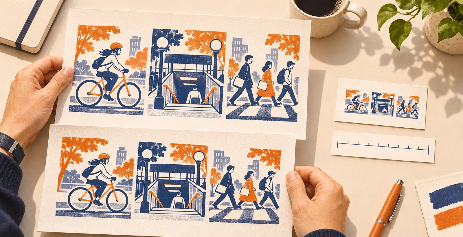
AI-generated illustration of a review setup, not a screenshot or performance measurement.
If one card looks heavier, remove a background feature before rewriting the whole style recipe. If the orange is too prominent, restrict it to one object, such as the station lamp. If the bicycle appears in another card, try the written treatment without the reference. When the image reads well at full size but fails in a card, simplify its silhouette or change the crop before adding detail.
Save the accepted files separately, alongside the shared recipe and the subject lines. If a fourth newsletter item arrives next week, reuse those notes and compare its thumbnail with the original three. The successful handoff is a set that looks related, with each image still doing a different editorial job.