

Krea 2 Style Reference Guide: Control the Look Without Losing the Subject
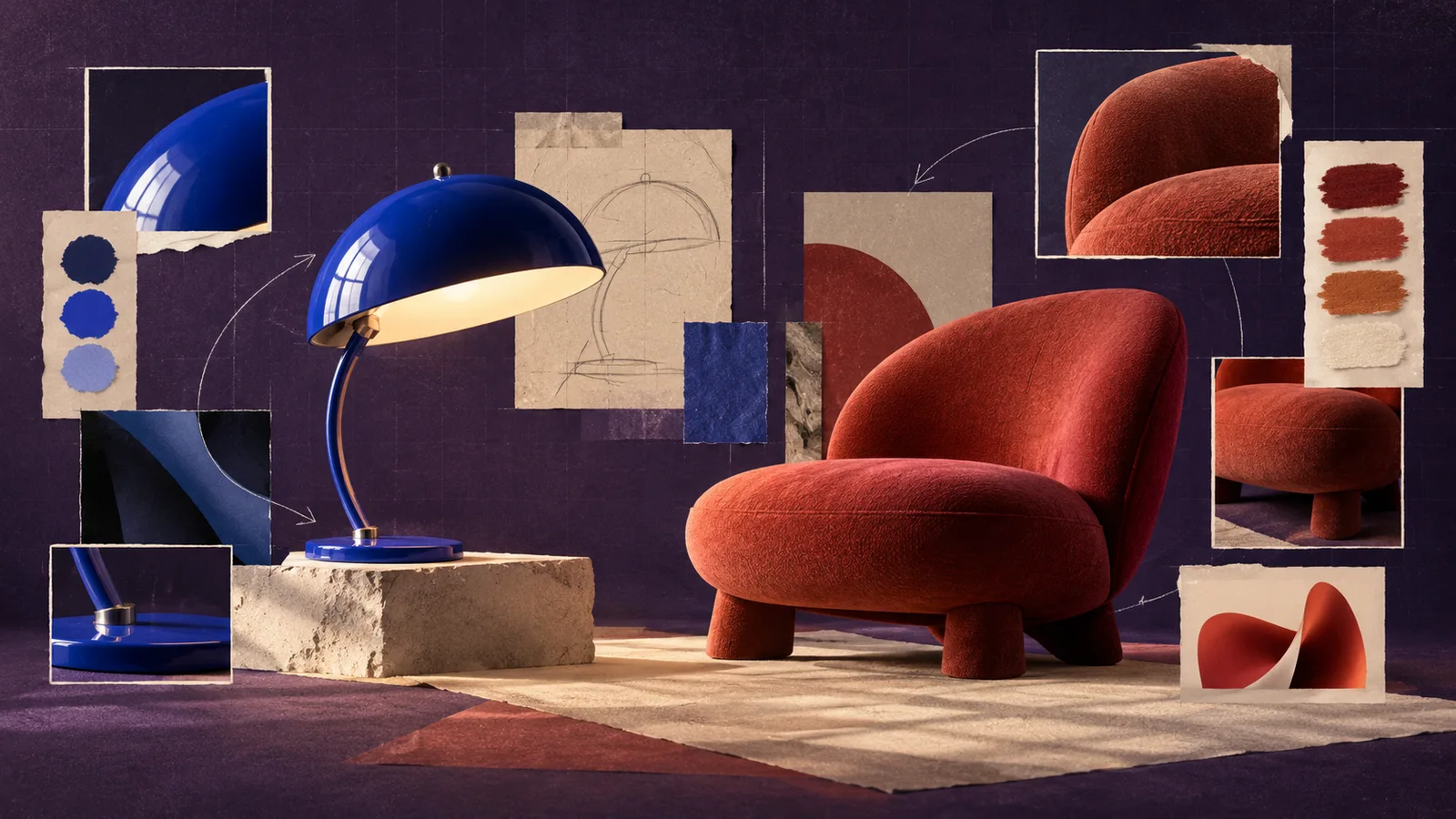
Krea 2 style references are most useful when words describe the subject and an image carries the visual treatment. The reliable workflow is to give each input one job: write what must appear, choose a reference with a readable look, start with moderate influence, and change one variable at a time. This makes it easier to spot whether the prompt or the reference caused an unwanted detail.
This guide uses one running example: a cobalt-blue desk lamp for a small editorial campaign. The new image should show the lamp on a pale wood desk, while a hand-printed poster supplies the limited colors, rough ink texture, and slightly imperfect edges.
Separate content from style before generating
Write two short lists before opening the generator.
Content that must appear
- One cobalt-blue desk lamp
- Pale wood desk
- Three-quarter camera angle
- Empty wall behind the lamp
- Horizontal frame with room for a headline
Style that may come from the reference
- Muted cream, cobalt, and rust palette
- Screen-printed texture
- Slightly uneven ink coverage
- Simple shapes with restrained detail
This split prevents the prompt and reference from competing. The prompt owns the new scene. The reference owns the look. If the poster also contains a bicycle, a person, or large typography, those elements are not part of the brief and should not appear in the lamp image.
Choose a reference that makes one visual idea easy to read
A useful style reference does not need to resemble the new subject. It needs to express the quality you want to transfer.
For the lamp example, a poster with a clear palette and obvious print texture is more useful than a crowded mood collage. A collage may contain several color systems, camera styles, and subjects, making it difficult to tell which signal should lead.
Review a candidate reference with four questions:
- Is the palette coherent?
- Is the texture visible at normal viewing size?
- Does the lighting or shading method support the new subject?
- Are there dominant objects that could leak into the result?
If the fourth answer is yes, crop the image to the cleanest region or choose another reference. When you need help naming what the image is doing, use the image-to-prompt tool to draft a description, then keep only the palette, medium, texture, and lighting terms that matter.
Build a content-first prompt
Start with the scene rather than repeating every quality visible in the reference:
A single cobalt-blue desk lamp on a pale wood desk, viewed from a three-quarter angle, empty cream wall in the background, horizontal editorial composition with clear space on the left.
The sentence establishes subject, setting, camera, background, and layout. The reference can carry the print treatment. Adding “screen print, rough ink, muted cobalt and rust, handmade poster” to the prompt as well may reinforce the look, but it also makes diagnosis harder. If the first result is too photographic, add one precise style phrase rather than a stack of synonyms.
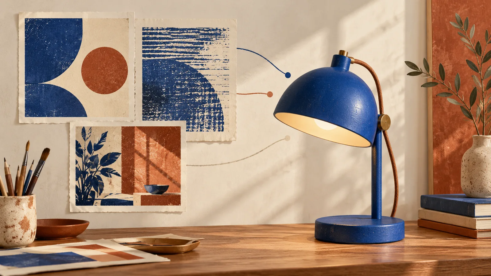
Concept illustration of a reference-planning workflow, not a Krea 2 test result.
Use strength as a controlled experiment
Reference strength changes the balance between the written subject and the visual source. Treat it as a test variable instead of searching for a universal percentage.
Run a simple ladder:
| Pass | What to change | What to inspect |
|---|---|---|
| Baseline | Use the prompt without a reference | Subject, camera angle, layout |
| Light influence | Add the reference at low influence | Palette and surface texture |
| Balanced influence | Increase the reference once | Whether the look is clear without changing the lamp |
| Strong influence | Increase only if needed | Whether poster objects or shapes begin to enter the scene |
Keep the prompt and aspect ratio fixed during this ladder. If you change the prompt, crop, reference, and strength together, you lose the ability to explain why the result improved.
There is no single best strength. A bold woodcut may need less influence than a subtle film photograph. The right setting is the lowest one that makes the intended look readable while leaving the subject and layout intact.
Mix references by assigning roles
Multiple references are useful when each has a distinct purpose. For example:
- Reference A supplies palette and print texture.
- Reference B supplies soft side lighting.
- The prompt supplies the lamp, desk, camera angle, and empty copy space.
Do not add a third reference just because the interface allows it. Add one only when you can name the missing signal. Two references with conflicting palettes or incompatible lighting directions often produce a compromise that looks less intentional than either source.
Test one reference first. Save an acceptable result, then introduce the second at low influence. If the lamp changes shape, return to the one-reference version and decide whether the added lighting is worth the loss of subject control.
Fix content leakage without rewriting everything
Content leakage happens when a style reference contributes unwanted objects, layout, or subject details along with its visual treatment. Krea’s technical description of Krea 2 identifies this separation as a core style-transfer challenge, so it is better treated as a controllable tradeoff than as a surprising failure.
Use the symptom to choose the correction:
| Symptom | Likely cause | First correction |
|---|---|---|
| Poster lettering appears on the wall | Typography dominates the reference | Crop out the lettering or use a cleaner reference |
| A second object appears beside the lamp | Reference contains a strong subject | Lower reference influence and restate “one lamp” |
| Lamp turns rust-colored | Reference palette overrides the product color | Restate cobalt blue as a preservation constraint |
| Composition copies the poster | Reference has a dominant layout | Add camera angle and copy-space placement to the prompt |
| Texture becomes dirty or noisy | Reference texture is too strong | Reduce influence before adding cleanup adjectives |
The fastest fix is usually subtractive: lower the influence, crop the reference, or remove one competing source. A longer negative prompt can introduce more concepts without solving the visual conflict.
Review the result in the right order
Check output from most important to easiest to repair:
- Subject: Is there one lamp, and is its silhouette usable?
- Composition: Is the angle correct, with real space for the headline?
- Palette: Does cobalt remain the product color while cream and rust support it?
- Style: Are the print texture and imperfect edges visible without obscuring the object?
- Small defects: Are there accidental letters, broken cables, floating shadows, or stray objects?
Reject a result with the wrong subject or layout before polishing its texture. Small surface defects may be repairable later; a campaign frame with the wrong composition usually requires another generation.
Save a reproducible style recipe
When a version works, record the prompt, aspect ratio, reference files, reference order, and strength values. Save the accepted image beside that recipe. “Use the same poster style again” is not enough to reproduce a set if the crop, order, or balance has changed.
For a second campaign image, keep the recipe fixed and change only the subject or composition. Compare the two outputs for palette, texture density, edge treatment, and lighting direction. Consistency is a checklist, not a vague feeling.
When you are ready to try the workflow, open the image workspace with one content prompt and one clean visual reference. If the first result misses the mark, use the Krea 2 prompt troubleshooting guide to identify the first variable to change.