

Krea 2 Prompt Troubleshooting: Fix Generic, Over-Styled, and Off-Target Results
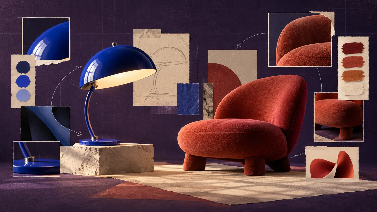
When a Krea 2 image misses the brief, adding more words is rarely the best first move. Identify the visible failure, decide whether it comes from the subject, composition, style, or reference, and change only that layer. A short controlled iteration teaches you more than a complete rewrite.
This guide uses a single brief: an editorial photograph of a red lounge chair in a quiet reading corner, warm late-afternoon light, limestone wall, vertical 4:5 composition, with clean space above the chair for magazine copy.
Diagnose the result before editing the prompt
Compare the result with the brief and name the first important mismatch. Do not start with “it looks bad.” Use a description you can act on.
| Visible result | Diagnosis | First variable to change |
|---|---|---|
| Looks polished but interchangeable | Too little visual direction | Add one medium, light, or texture cue |
| Correct style, wrong chair or setting | Subject definition is weak | Restate required objects and scene |
| Beautiful image with no copy space | Composition is underspecified | Add placement, camera, and negative space |
| Reference objects appear in the room | Style-reference content leakage | Lower influence or crop the reference |
| Heavy texture hides the chair | Style influence is too strong | Reduce style strength before rewriting |
| Every retry changes completely | Too many variables move at once | Freeze the prompt, ratio, and references |
Pick the highest-impact problem. A missing chair matters more than a slightly cool highlight. Fixing small surface details before the subject and layout are stable wastes iterations.
Create a baseline you can compare
Start with a compact prompt that describes the deliverable:
Editorial interior photograph of one red lounge chair in a quiet reading corner, warm late-afternoon side light, pale limestone wall, vertical 4:5 frame, chair in the lower two-thirds, clean wall space above for magazine copy.
Generate a baseline and save it even if it is imperfect. Record the prompt, aspect ratio, and any reference image. The baseline gives every later change a comparison point.
If you begin with a long prompt full of camera brands, era labels, materials, emotional adjectives, and exclusions, you will not know which instruction helped. Krea 2 is designed to explore when the prompt is open and narrow when the prompt becomes more specific. Use that behavior deliberately: keep early discovery broad, then add the detail that corrects the chosen failure.
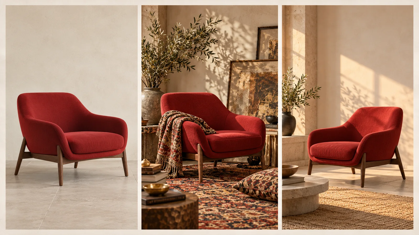
Concept illustration of three troubleshooting states, not a Krea 2 benchmark or before-and-after test.
If the image looks generic, add one visual decision
“Generic” usually means the brief defines the object but not the visual treatment. Choose the missing decision rather than adding a paragraph.
Useful additions include:
- Medium: editorial interior photograph, cut-paper illustration, charcoal study
- Lighting: low winter sun from camera left, broad overcast window light
- Surface: fine film grain, chalky limestone, matte woven upholstery
- Camera language: eye-level, centered elevation, close three-quarter view
- Color relationship: red chair against warm off-white stone, restrained brown accents
For the chair example, add only:
Fine film grain and a restrained 1970s interiors-magazine palette.
Then compare against the baseline. If the new version has a useful look, keep the phrase. If it changes the furniture or destroys the copy space, remove or weaken it.
A style reference can replace a long list of adjectives when the target look is easier to show than describe. Read the Krea 2 style reference guide before adding several images at once.
If the prompt feels crowded, rank the instructions
Crowded prompts often contain several competing versions of the same decision:
Minimalist but richly decorated reading corner, bright yet moody, clean editorial photography with rough painterly texture, symmetrical asymmetrical composition.
The problem is not length alone. The prompt asks for opposing treatments without saying which one matters.
Rewrite it in priority order:
- Subject and action
- Setting
- Composition
- Light
- Style and texture
- Preservation or exclusion constraints
For example:
One red lounge chair in a quiet reading corner. Pale limestone wall and a small walnut side table. Vertical 4:5 editorial photograph, chair low in frame with clean space above. Warm side light and fine film grain. No people or additional chairs.
This version is not effective because it is longer. It is effective because each sentence controls a different layer.
If the style takes over, remove duplicate signals
An over-styled result may come from three signals pushing in the same direction: a strong reference, repeated style adjectives, and a preset. Reduce duplication before asking the model to “make it cleaner.”
Use this order:
- Keep the subject and composition prompt unchanged.
- Lower reference influence once.
- Remove style words already visible in the reference.
- Disable a preset that duplicates the same treatment.
- Generate again and compare the chair silhouette and copy space.
If rough brush texture comes from the reference, the prompt does not also need “rough, distressed, painterly, tactile, handmade, weathered.” One accurate signal is easier to control than six overlapping ones.
If the subject drifts, make nouns and counts explicit
Subject drift appears when the model changes the object, duplicates it, or replaces a required feature. Strengthen the content layer with concrete nouns, counts, and preservation details:
- “One red lounge chair,” not “seating.”
- “Pale limestone wall,” not “luxury interior.”
- “No people or additional chairs,” only after the unwanted object has appeared.
- “Keep the chair fully visible,” when cropping is the problem.
Avoid describing every object you do not want. Mentioning a long list of forbidden furniture still places those concepts in the prompt. State the required scene positively, then add one targeted exclusion based on an observed failure.
If you are working from an existing image, write down the details that must survive: chair color, number of legs, upholstery, camera angle, and surrounding architecture. Review those items before judging mood or polish.
If the composition is wrong, use spatial language
Aspect ratio does not decide composition on its own. A 4:5 frame can still center the chair and fill the entire wall.
Add spatial instructions that can be seen and checked:
- Chair in the lower two-thirds
- Empty wall in the upper third
- Camera at seated eye level
- Side table to the right, not behind the chair
- Full chair visible with floor contact shadow
- No foreground object blocking the seat
Generate once with the new composition language and keep the style fixed. If the layout becomes correct but the mood weakens, treat lighting as the next separate pass.
If a reference adds unwanted content, simplify the source
A reference can contain the desired palette and an unwanted subject at the same time. Increasing prompt detail may not solve that conflict.
Try these corrections in order:
- Crop the reference to a texture, palette, or background region.
- Lower reference influence.
- Replace it with an image that expresses the same style with fewer dominant objects.
- Restate one required subject fact, such as “one red lounge chair.”
Do not combine a portrait, an interior, a poster, and a color swatch until each source has a named role. If you cannot explain what a reference contributes, remove it from the test.
Keep an iteration log that answers one question per pass
A useful log can be very small:
| Version | Single change | Outcome | Keep? |
|---|---|---|---|
| A | Baseline prompt | Correct chair, generic light | Yes, as control |
| B | Added late-afternoon side light | Better depth, layout unchanged | Yes |
| C | Added print reference | Texture good, extra lettering appeared | No |
| D | Cropped reference to texture | Texture retained, lettering gone | Yes |
This record prevents circular editing. It also makes a successful result easier to reproduce for the next asset in a campaign.
Know when to stop generating
Stop when the major brief is correct: subject, composition, palette, and lighting. Small production tasks such as exact headline typesetting, logo placement, minor edge cleanup, or color matching may be faster and safer in a layout or image editor.
AI generation is strongest when exploring and establishing the scene. A final advertising asset still needs human review at its intended display size. Check hands and faces when present, product details, shadows, reflections, accidental text, and whether the promised copy space actually works with the real headline.
To build the first baseline, open the image workspace and save the prompt before changing anything. If you are starting from a visual example but cannot name its useful qualities, run it through the image-to-prompt tool, then delete any description that does not belong in the new scene.