

Krea 2 Creative Exploration: Choose an Art Direction Before Refining
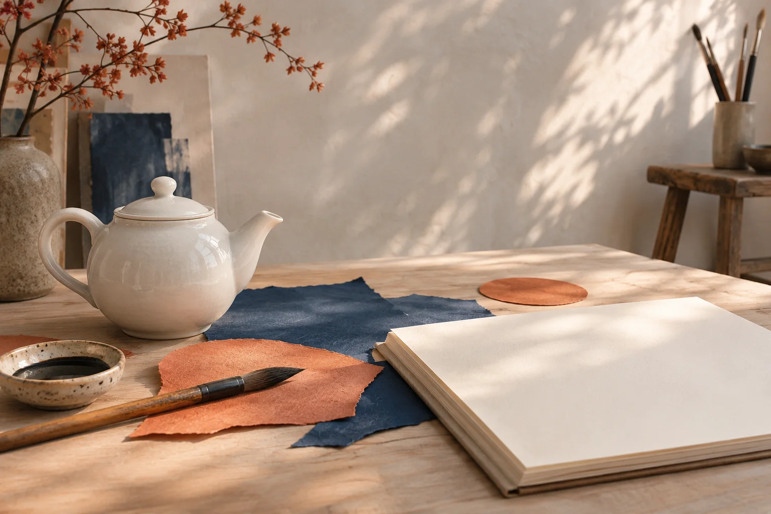
An image can be beautifully made and still leave the main question unanswered: is this the right direction for the project? When the brief is open, polishing the first attractive result can commit you too early.
For Krea 2 creative exploration, begin with a small brief, leave a few visual choices open, and compare distinct concepts before refining one. Separate the requirements an image must meet from the qualities you simply prefer. That gives variation a purpose and gives the session a stopping point.
Krea's Krea 2 model page describes a model that responds to simple, open prompts with varied visual ideas. This guide turns that creative premise into a practical selection method. It is an editorial workflow, not a measured comparison of model outputs.
On Krea2.io, the image workspace lets you prepare prompts and choose the generation settings currently available. Use the selected model shown there; this guide does not assume every service exposes the same Krea 2 model or controls. All illustrations below are original teaching concepts, not Krea test results.
Write the smallest brief that still defines the job
A useful exploration prompt leaves room for interpretation without hiding the assignment. “Something beautiful” has no practical selection criteria. A paragraph specifying every brushstroke leaves little room to discover a direction.
Our example is an editorial image for a short article about taking an afternoon pause. The brief is deliberately small:
One white ceramic teapot for an editorial image about a quiet afternoon pause. A calm, uncluttered scene, no lettering, and enough clear space for a short headline.
Before generating, record the fixed requirements:
- One recognizable teapot, with a usable handle and spout.
- A calm mood that suits the article.
- A composition that can accommodate the planned headline.
- No lettering or additional products inside the generated image.
Leave the medium, viewpoint, setting, and supporting palette open for the first pass. This is an imagined editorial object, so exact manufacturer geometry is not part of the task. A real product campaign would need stricter references and a separate identity check.
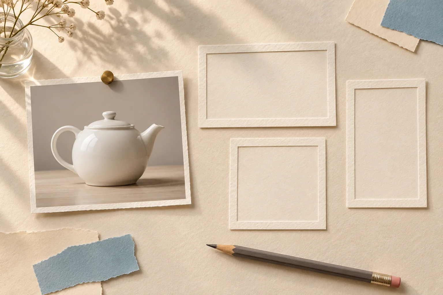
AI-generated editorial illustration of the brief. The empty frames represent choices still to make; this is not a generator interface or an actual Krea result.
Give exploration a limit before you start
Decide what this session is allowed to spend: a time limit or a small generation allowance that fits the credits displayed in your workspace. Reserve part of that allowance for improving the selected direction. Spending everything on discovery leaves no room to make the winner usable.
There is no universal number of generations that produces a good idea. For a small assignment, you might plan one initial review and a few deliberate branches, then stop to choose. Treat that as a working limit, not a promise about cost or success.
Open the image workspace, select Text-to-Image, and choose the available model, aspect ratio, and resolution. Use the destination's shape early enough to judge the layout. Keep the model and format stable during the first comparison so you have fewer variables to interpret. Check the displayed credit requirement before each run.
Save the prompt and settings with each candidate. If the workspace does not expose a seed or other reproducibility control, do not assume the same prompt will recreate the same image later. Keep the actual candidate file.
Look for a different idea, not just a different color
Review the initial candidates at the same size. Differences in framing, medium, atmosphere, or visual metaphor can suggest useful branches. A blue background and a green background around an otherwise identical scene are a narrower choice.
For the teapot brief, these are three possible directions to explore:
| Direction | Creative choice | Why it might fit | Main tradeoff |
|---|---|---|---|
| Domestic photograph | Three-quarter tabletop view in afternoon light | Makes the pause feel familiar and lived-in | Props and background can crowd the headline |
| Graphic paper collage | Overhead shapes, limited palette, tactile edges | Gives the article a clear editorial identity | Stylization can weaken the teapot silhouette |
| Ink-and-wash drawing | Spare side profile with airy white space | Keeps the mood quiet and leaves room for type | Light marks may lose impact at small sizes |
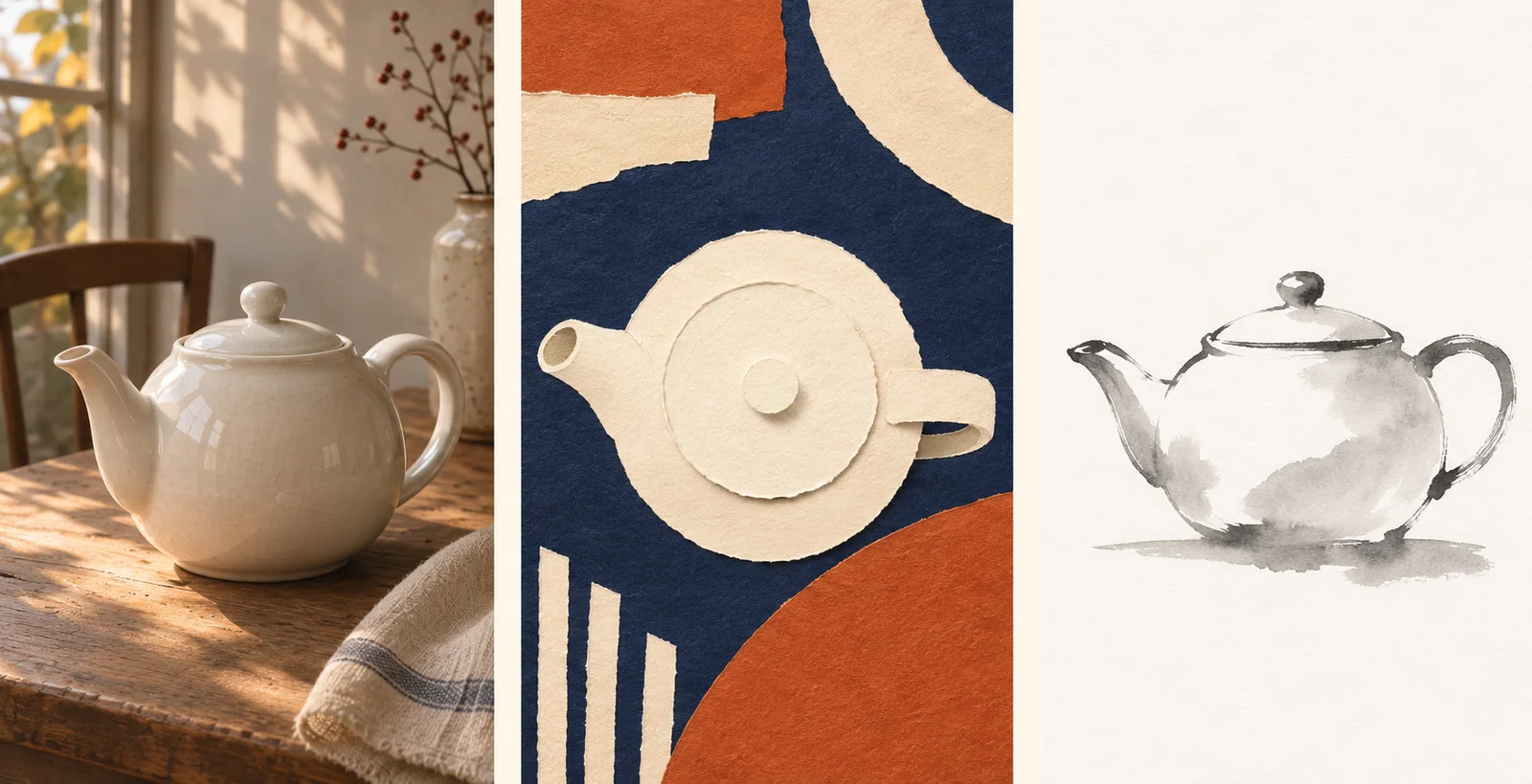
Concept illustrations made to explain different art directions. They are not outputs from a shared Krea prompt, a benchmark, or evidence that one model produces these exact variations.
To investigate a branch, change one major creative choice while retaining the brief. For example:
Explore the teapot brief as a handmade paper collage. Use a simple overhead composition, a navy, rust, and cream palette, and broad clear space for a headline. Keep one recognizable teapot and add no lettering.
This is a separate direction, not a correction to the photographic candidate. Do not ask the same image to be a photograph, a collage, and an ink drawing simultaneously unless that hybrid is the idea you actually want to evaluate.
If the first candidates cluster around the same interpretation, deliberately change the medium or viewpoint. If they are already usefully different, pause and compare them instead of generating more simply because you can.
Choose with requirements first and preferences second
Use two passes. First eliminate candidates that fail the assignment. Then compare the viable directions on their merits. A spectacular texture cannot rescue a concept with no room for the headline.
For this brief, the review sheet could be:
| Question | Type of decision | What to record |
|---|---|---|
| Is there one readable teapot? | Must pass | Any broken silhouette or unwanted extra object |
| Does the planned headline fit? | Must pass | The actual empty area available at delivery size |
| Does the mood support an afternoon pause? | Must pass | A short reason tied to the article |
| Which medium gives the article the clearest identity? | Preference | Photograph, collage, or drawing, with a reason |
| What would the next revision need to change? | Effort estimate | One specific fix or a fundamental rebuild |
Test headline space with a temporary layout in your design editor rather than imagining that text will somehow fit later. View the candidate at its expected display size. Small textures, delicate outlines, and busy shadows can read differently when reduced.
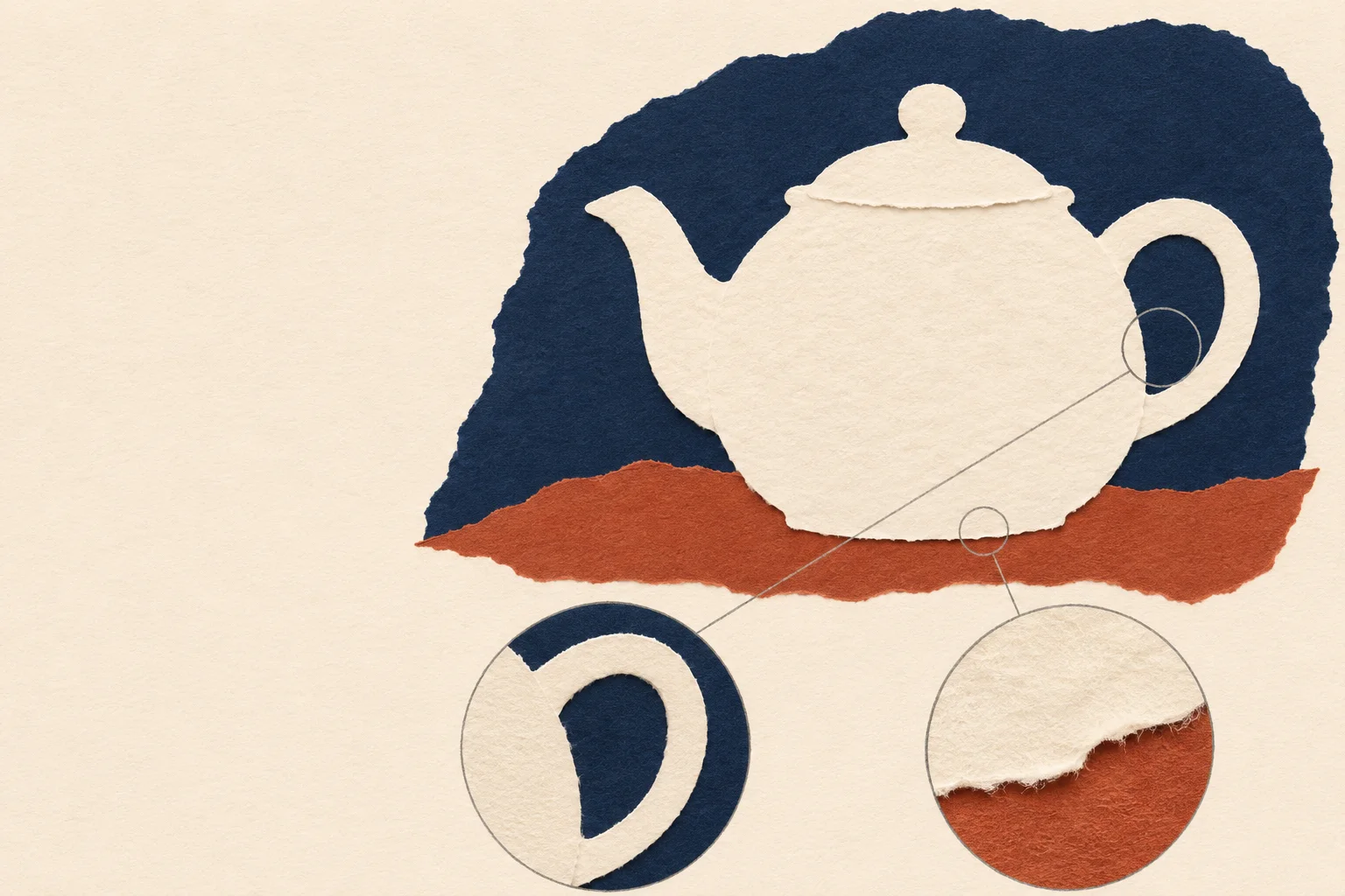
AI-generated review diagram. It illustrates silhouette, usable space, and texture checks; it is not a tested output or a quality score.
Write a sentence for the strongest candidate: “The collage direction supports the quiet editorial tone, has room for the headline, and needs only a clearer handle opening.” That is more useful than “this one looks best.” Keep a runner-up with a different idea in case the preferred route proves difficult to finish.
Turn the chosen direction into a refinement brief
Once a direction wins, stop reopening all the choices. Record the elements that earned the selection and identify the smallest change needed next.
For the collage example:
Keep the paper-collage medium, navy and rust accents, quiet mood, and clear headline area. Make the teapot's handle opening easier to read while retaining a simple silhouette. Reduce small decorative fragments near the copy area. Add no text or extra objects.
At this point, an image-reference workflow can help you carry the selected concept into a revision, subject to the model options available. If you need to communicate a precise visual treatment through a reference, the style reference guide covers that next stage.
If the revision fails a known requirement, switch to diagnosis rather than more open exploration. The prompt troubleshooting guide helps separate subject, layout, and style problems. Choosing a direction and repairing a defect are different decisions.
Stop when the next useful step is outside generation
End the exploration session when you have a viable direction with a manageable revision plan, when the allowance is used, or when the remaining uncertainty requires a human choice. A client deciding between a familiar photograph and an expressive collage needs a clear presentation, not another unfiltered folder of images.
Save the selected image, runner-up, prompts, settings, and brief. Give each direction a short descriptive name, and record why you selected or rejected it. Preserve the rejected concept rather than blending its strongest feature into every later revision; that can erase the reason the chosen direction worked.
For delivery, place the approved headline and final typography in the layout, inspect the crop, and check the result at its actual viewing size. The outcome of exploration is a decision you can explain and a focused next action. A large number of images is useful only when it helps you reach that point.
Checked November 7, 2026: Krea's model page and the Krea2.io workspace. Developer descriptions are not independent tests or guarantees of output diversity, generation speed, exact reproduction, or site pricing. No paid model-generation benchmark was conducted for this guide.