

Krea 2 Film Photography Prompts for Website Images
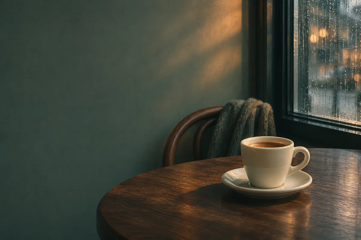
A film-style cafe image needs a readable subject, a deliberate light source and enough quiet space for the page layout. For Krea 2 film photography prompts, describe those decisions before adding grain. Then judge the image in the website crop where it will appear.
Krea's introduction to Krea 2 describes its range from grainy film photography to studio imagery and explains reference-based style control. The workflow below turns that creative direction into a brief for a cafe homepage. You can prepare and adapt the brief in the Krea2 image workspace, checking the selected model, available settings and displayed credit cost before generating.
Describe the light and the focal point
Our example is one ivory espresso cup on a walnut table near a rainy window. The cup is the subject. Warm window light, cool shadows and a muted palette supply the mood.
Write the image without texture adjectives first. Specify where the camera sits, which object should be sharp and where the light falls. A clear rim and handle make the cup recognizable even when the image becomes a small mobile crop.
Try this original starting prompt:
An ivory ceramic espresso cup on a dark walnut cafe table beside a rain-streaked window. Eye-level view, with the cup on the right half of a horizontal frame. Soft window light from the left, a warm highlight along the cup rim, muted cool shadows, and visible detail in the tabletop. Keep the cup rim and handle in focus. Leave a calm, softly lit wall on the left for a website headline. Restrained color saturation and subtle fine film grain.
Change the cup, setting and copy position to match your page. Lens or film-stock names can suggest a direction, but the visible decisions in this prompt give you something concrete to inspect.
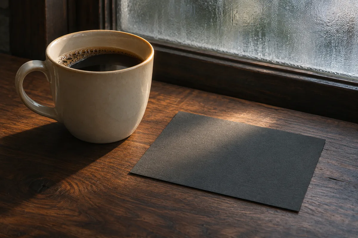
Generated concept illustration of the lighting brief.
Give grain a smaller role than material texture
The ceramic glaze, walnut grain and fabric weave already give the image texture. Ask for photographic grain as a light finish over those materials. An instruction such as “heavy grain, gritty, distressed, faded, noisy” gives several competing effects room to dominate the scene.
If you have a film reference you can use, choose one whose light and color support the cafe brief. Describe its role as palette and fine photographic texture. The style reference guide explains how to keep reference content from taking over the subject.
Inspect these areas in each candidate:
- The cup edge should read as one continuous curve.
- The dark tabletop should retain enough tonal separation to show its surface.
- The wall reserved for copy should remain calm enough for the headline.
- Small marks should make sense as wood, glaze or photographic texture.
For a candidate with a clear composition but coarse texture, keep the scene instruction and revise the finish:
Retain the cup position, window light, focus and muted colors. Reduce the visible photographic grain to a subtle, fine texture. Preserve the smooth ceramic glaze and the readable wood surface.
Review the new image before changing another part of the brief. When a result has broader styling problems, use the prompt troubleshooting guide to diagnose the next adjustment.

Generated material study for inspecting surface detail.
Test the actual website crop
Place a candidate in your layout as soon as the cup and light work. A landscape image can lose the cup handle when a mobile container crops the sides. The copy area may also move across the bright window as the container changes shape.
Preview the page at desktop and mobile widths. Check where the cup lands, whether the complete handle survives, and how the headline reads over the background. Adjust the focal position or make a separate mobile crop when the page needs it. If the composition cannot serve the layout, generate another framing with the same light and material brief.
Keep final website text in the page layout so you can adjust its size, position and contrast. For the image itself, leave the requested wall space clear.
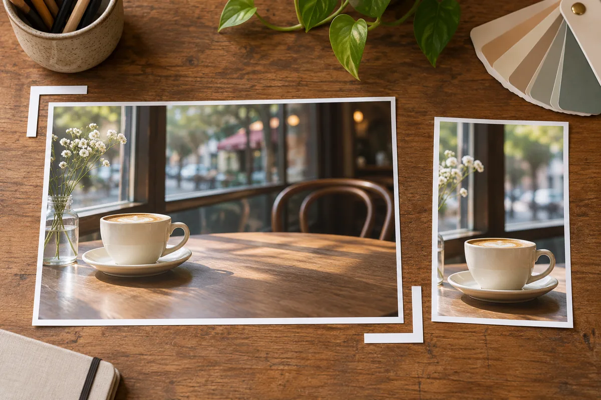
Generated illustration of planning landscape and portrait crops.
Export once the image works in the page
Review the selected source at full size for broken edges and distracting marks. Then resize and export a copy for the intended display. Compare the exported file in the page against the source at that same on-screen size. Grain and fine surface detail can change appearance after resizing and compression.
Use the same crop while comparing export settings. Check the dark tabletop, the cup rim and the smooth wall behind the headline. If the export adds blotchy patches or loses the rim, adjust compression or output dimensions and compare again. Keep the source file so later crops can start from it.
Record the prompt, selected model and settings, source filename, crop and final export dimensions alongside the chosen image. These details let you build another page image with a comparable brief and check it against the approved result.