

Krea 3 Ad Resizing: Adapt One Visual for Square and Vertical Layouts
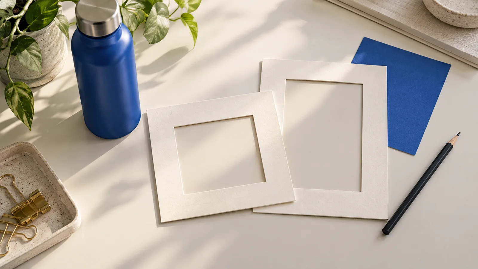
Krea 3 ad resizing starts with a composition decision: can the new format use a simple crop, or does the image need more background and a different subject position? Changing an aspect ratio alone does not ensure that the product, headline, and call to action will still fit.
Krea's Krea 3 launch announcement names adapting an ad to a new format as one use case. This guide turns that idea into an original planning workflow: start with one approved visual, make a square or portrait variation, and review what changed before placing the final copy.
You can prepare reference-image variations in the Krea2 image workspace. Use the models and settings available there; model-specific capabilities described by Krea do not establish identical behavior across every image service.
Decide whether to crop, recompose, or extend
Imagine a landscape campaign image with a cobalt blue bottle on the right and a headline on the left. A centered square crop could remove the headline. A tight portrait crop could remove the bottle's cap or base. Shrinking the entire artwork into a tall canvas would preserve the pieces but might make them too small to read.
Choose the lightest change that solves the layout problem:
| Starting condition | Approach | What needs checking |
|---|---|---|
| The subject and copy already fit within the new frame | Crop in a design editor | Nothing essential is clipped or pushed against an edge |
| The product fits, but the available copy area is in the wrong place | Recompose a reference-based variation | Subject identity, scale, and a usable empty area |
| The existing composition needs more surroundings | Ask for a variation with additional background space | Repeated objects, inconsistent shadows, and invented detail |
Cropping is a good first option when the visual already works. Generative editing is more useful when you need new surroundings or a different arrangement. An aspect-ratio selector specifies the output shape; it is not, by itself, a guarantee of background extension or preservation of the original pixels.
Separate the visual master from approved copy
Keep the original campaign artwork unchanged. If you have a clean image without text overlays, use that as the reference for a new composition. Keep the headline, offer, price, URL, and call to action in a separate copy sheet or editable design file.
For our example, the visual master is an upright blue bottle with a silver cap on a warm cream background. The copy is short: a headline, one supporting sentence, and one button label. The goal is to make room for these elements without changing the bottle's recognizable shape.
If your only source is a flattened poster, preserve a copy of it and record every word before experimenting. Prefer an original product photograph or clean export when one is available. A model may redraw text rather than retain it exactly, even when you request preservation.
For work where a specific label must remain exact, a practical fallback is to generate a background concept and composite the approved product asset in your design editor. Review the edges, contact shadow, and placement after compositing.
Map the copy space for each format
Plan one square and one portrait variant before generating. The following layouts are editorial examples, not placement specifications for an advertising platform.
| Format | Product position | Copy area to reserve | First review question |
|---|---|---|---|
| Square, 1:1 | Lower right, with the whole bottle visible | Upper left | Can the headline fit without covering the cap? |
| Portrait, 4:5 | Lower right or lower center | Upper portion | Is there enough separation between product and copy? |
| Tall portrait, 9:16 | Lower middle, away from the outer edge | Above the product | Does the bottle remain readable at the intended display size? |
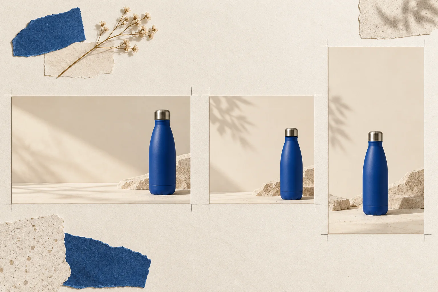
Original AI-generated planning illustration. These cards explain composition choices; they are not Krea 3 outputs or a consistency benchmark.
Draw a rough text box over a copy of your reference if that helps you plan. You do not need to upload the marked version: a written brief can describe the intended empty area. Preview the finished layout in its destination before publishing, because interface overlays, crops, and placement requirements can differ.
Krea's model page describes using references to guide composition, subject, and style. Make those roles explicit rather than asking the model to infer which parts of a finished poster are essential.
Write a brief for one target ratio
Start with the square variant. Use an original prompt such as:
Create a square campaign image using the uploaded blue bottle as the product reference. Keep its upright silhouette, blue body, silver cap, and recognizable proportions. Place the complete bottle in the lower-right area on a warm cream surface. Keep the existing calm daylight mood. Leave an uncluttered area in the upper left for a short headline and one supporting sentence. Include the whole cap and base. Do not add words, logos, extra products, or decorative objects.
The subject requirements and copy area have different jobs. The first tells you what to compare with the reference; the second tells you whether the new layout can carry the message.
For the portrait variant, return to the original visual master and replace the layout instruction:
Create a tall portrait campaign composition. Place the complete bottle in the lower-middle area and leave generous plain background above it for the headline. Keep the same bottle design, cream palette, and daylight direction. Keep the product clear of the frame edges. Do not add text or additional objects.
Select the target ratio in the workspace as well. A prompt saying “portrait” and a square output setting give conflicting directions. Use the Krea 3 prompt guide if you need a broader method for separating preservation requirements from requested changes.
Generate one baseline, then review it
In Krea2, choose Image-to-Image, upload the clean visual master, enter the brief, and select the intended aspect ratio. Review the selected model, resolution, and displayed credits before starting. Begin with one output per format so the result is easy to connect to its settings.
Avoid creating the portrait version from an already modified square image unless you deliberately want to carry those changes forward. Returning to the same master makes it easier to compare each variant against the approved source.
If the campaign still needs a different setting or light, settle that first using the product background and lighting workflow. Otherwise, keep the setting stable while evaluating format changes.
Inspect each candidate in two passes:
- Product check: compare the cap, shoulder, base, color, label, and number of products with the master. Reject a composition that relies on an altered product to make the layout work.
- Layout check: place a temporary text box in the reserved area. Confirm that the actual approved wording fits at a readable size without covering the product.
An attractive blank area is not enough if the headline only fits when reduced to tiny type. Equally, a faithful product image does not help if the new composition leaves no practical space for the message.
Correct the failed part without changing the campaign
Use a narrow revision when the subject is acceptable but the layout needs work:
Keep this product design, background palette, and lighting. Move the bottle slightly lower and reduce its size enough to create more empty background above it. Keep the entire cap and base visible. Add no text or new objects.
If the bottle itself changed, return to the original reference instead of repeatedly refining the altered version. If two attempts still cannot produce a usable arrangement, consider a simpler layout or manual compositing rather than spending more iterations on the same ambiguous brief.
For each candidate, record the filename, ratio, intended change, and unwanted change. A simple note such as “square: copy fits, but cap shape changed” is more actionable than “version three looks best.”
Add final typography and export
Once the image passes review, place approved text and brand assets in your design editor. Check spelling, punctuation, offer details, line breaks, and button wording against the copy sheet. Do not assume that words visible in a generated image are an exact match.
Export to the destination's required dimensions and file type, then inspect the exported file at its intended display size. Verify that no product detail is clipped, the copy remains readable, and the composition survives the destination preview.
Start with one campaign visual in the Krea2 image workspace. Choose one new ratio, reserve space for the real message, and approve the product and layout separately before building the next format.
Model information and workspace controls checked October 31, 2026. Prompts and layout examples are original editorial guidance; no paid model generation or cross-model performance test was performed.