

Krea 3 Product Backgrounds and Lighting: An Editing Workflow
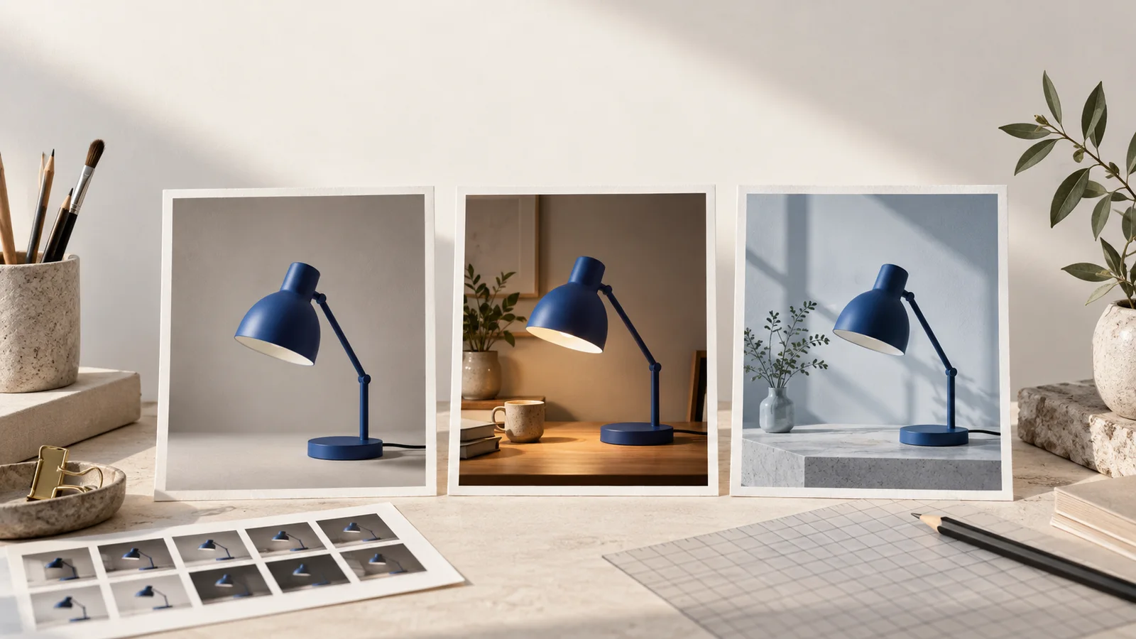
When using Krea 3 to restage a product, separate the background decision from the lighting decision. First define the product details that must survive the edit. Then build a simple scene around the source and check the object before adjusting the atmosphere. You can start in the image workspace with Krea3 selected and your product photograph uploaded in Image-to-Image mode.
This workflow uses an amber glass soap bottle with a black pump. The intended result is a landscape image on pale stone, with space on the left for campaign copy. It is a practical brief and review process, not a claim that every generated image preserves packaging perfectly.
Prepare a source you can inspect
Choose a photograph with the entire bottle and pump visible. Check that the silhouette is not hidden by another object and that important marks are readable. A dark, reflective bottle photographed against a dark background can make its edges difficult to judge.
If a label is important, retain a clear original or approved artwork for comparison and finishing. Do not rely on a small generated preview to validate fine print. A visually plausible word can still be the wrong word.
Write a product checklist before uploading:
| Detail | What to compare with the source |
|---|---|
| Bottle silhouette | Shoulder curve, neck width, body proportions |
| Pump | Spout direction, length, collar, stem |
| Surface | Glass color, transparency, reflections |
| Artwork, when present | Lettering, mark placement, label shape |
| Placement | Whether the bottle rests convincingly on the surface |
The checklist is specific to the photographed product. For a shoe, replace the pump checks with sole profile, stitching, laces, and fastening details. Keep the method; change the acceptance criteria.
Make the first background brief simple
Use one product reference first. Describe the surface and backdrop in words unless a particular room or arrangement needs a second reference. A scene photograph containing a similar bottle can introduce an unwanted second product design.
Try this starting instruction, adapting it to your actual source:
Use the bottle in image 1 as the product source. Preserve its amber glass, body proportions, neck, and black pump. Place it on a pale limestone slab against a warm ivory plaster background. Keep the complete bottle visible, slightly right of center in a landscape frame, with empty space on the left. Use soft window light from the upper left and a natural contact shadow. Add no new lettering or extra bottles.
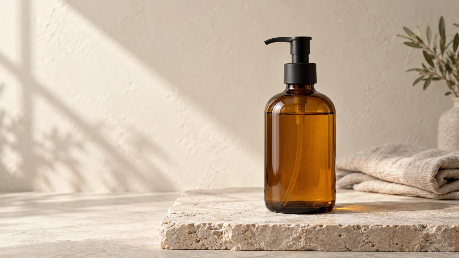
Concept illustration of the target scene, not a Krea 3 output or a product-preservation test.
If the source has a label, explicitly add the label to the preservation instruction and compare it afterward. Do not copy “unbranded” into a prompt for a branded product just because an example image has no label.
Review the first result for product accuracy and usable framing. The image is not ready simply because the stone surface looks convincing. A changed pump or stretched bottle body is a reason to return to the source.
Adjust the light after the scene works
Once a background version is acceptable, decide what the light still needs. “More dramatic” is a broad request. “A softer shadow” or “a brighter left edge” gives the next attempt a narrower purpose.
For an accepted scene, try:
Keep the product design, placement, camera framing, and background arrangement. Soften the light from the upper left so the shadow has a gentler edge. Retain a visible contact shadow beneath the bottle. Do not recolor the glass or change the pump.
Changing the light necessarily changes highlights and shadows. Do not ask for every pixel to remain identical while also requesting a different lighting setup. Instead, name the product and layout features that matter, and inspect how the new illumination affects their appearance.
Keep the original product source available. If the lighting edit changes the bottle itself, return to the original source and describe the accepted background plus the revised light, rather than repeatedly editing a damaged version.
Inspect the details that make a product look real
A bottle can have a plausible silhouette yet appear to float. Look for a contact shadow close to the base, and check whether reflections agree with the described light direction. The point is not to demand a physically measured studio simulation; it is to catch distracting inconsistencies before delivery.
| Problem | Next revision to try |
|---|---|
| Product floats above the slab | Ask for the base to sit on the surface with a visible contact shadow |
| Glass color has shifted too far | Restate the source glass color and reduce the lighting change |
| Reflections hide important lettering | Request softer highlights, then verify the original artwork separately |
| Background includes extra products | Remove the scene reference or explicitly keep a single bottle |
| There is no space for copy | Specify an empty side of the frame and simplify props |
Use these checks at the intended display size and in a close view. A fault that is invisible in a social thumbnail may still matter in a large product-detail image. Inspect the downloaded file, not only the preview.
Create a second scene without losing the reference
For a new campaign variation, keep the same product source and checklist. Change the setting first: a bathroom shelf instead of the stone slab, for example. Review that result before introducing a different lighting direction or camera angle.
Do not call a set consistent merely because all its backgrounds share a color palette. Compare the bottle proportions, pump, glass tone, and artwork across the set. Reject or finish discrepancies before adding final copy in a layout editor.
Save each accepted image with its prompt and input order. If you cannot explain how a result was produced, it becomes harder to request a closely related version later.
For help simplifying the instruction, read the Krea 3 prompt guide. If the source needs a written description, Image to Prompt can provide a draft to check and shorten. Then open the image workspace and start with one product, one scene, and a clear acceptance checklist.