

Krea 3 Product Recoloring: Plan Colorways Without Losing Material Detail
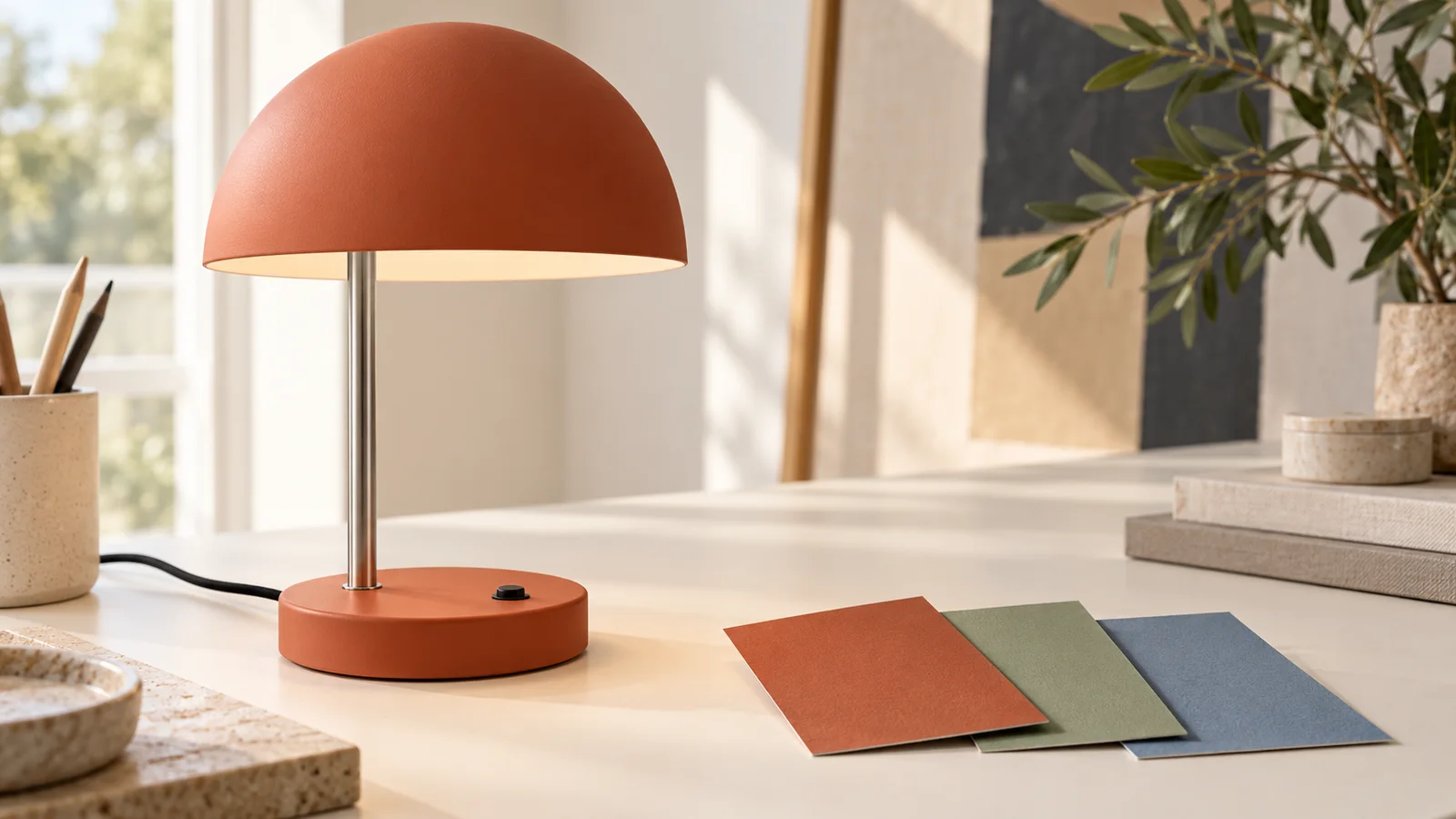
A useful Krea 3 product recoloring brief names both the surfaces that change and the parts that keep their original appearance. “Make this lamp green” leaves too much undecided: should the metal stem change, should the cable turn green, and should the painted finish become glossy?
Start with one clear product photograph, map the editable parts, and generate each colorway from that same source. Review shape and materials before deciding which color you prefer.
Krea's Krea 3 launch article lists product colorways among its editing use cases. The workflow below develops that idea through an original desk-lamp example. You can prepare the same kind of reference-image brief in the Krea2 image workspace, using the models and controls actually available there. Model behavior and settings can differ between services.
Choose a source that makes the parts visible
Use a photograph where the product silhouette, surface boundaries, and small fittings are easy to inspect. A neutral setting helps you judge the recoloring without confusing it with a change in the scene.
For this example, imagine a desk lamp with a painted dome shade and circular base, a brushed-silver stem, a small black switch, and a black power cable. The task is to explore sage and dusty-blue paint options while keeping the metal and black parts unchanged.
Prefer the original image over a previous generated variation. Keep it in a separate master folder, with a note identifying the current finish. If the stem blends into the background or the switch is hidden, use a clearer source before attempting a selective edit.
A second angle can help explain a confusing part, but decide which image controls the composition. Do not upload several views without stating their roles. Krea's model page describes references as guidance for composition, subject, and style; your brief should identify the guidance you intend each reference to provide.
Map painted surfaces separately from other materials
Make a small component list before writing the prompt. For our lamp, the list looks like this:
| Component | Requested change | What should remain recognizable |
|---|---|---|
| Shade exterior | Change paint color | Dome shape, rim, and matte finish |
| Base exterior | Use the same new paint color | Round outline and switch opening |
| Metal stem | No recoloring | Brushed-silver appearance and thickness |
| Switch and cable | No recoloring | Black color, placement, and visible shape |
| Background and shadows | Keep the existing scene | Camera view, surface, and light direction |
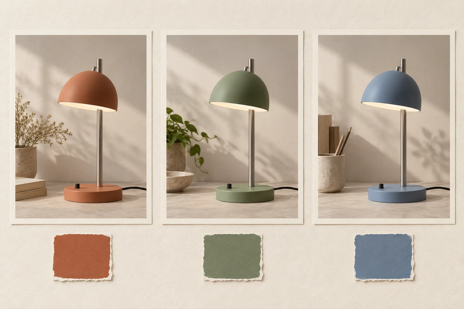
Original AI-generated colorway planning illustration. These cards are not Krea 3 test outputs, exact color samples, or proof that an edit preserves every component.
This map is more useful than a long list of style adjectives. It gives you a reason to accept or reject the result: the base may look good in sage, but a green stem would violate the brief.
Do not change color, material, and lighting at the same time when you want to evaluate paint options. A glossy surface under warmer light may look like a different color even if the prompt uses the same color name.
Describe the color and its source
Choose whether you need a broad visual direction or a specific product-color target. “Muted sage green with a matte painted finish” is enough to explore a concept. A real paint chip or approved product sample is a stronger reference when the hue matters to the project.
If you upload a swatch, give it a narrow role:
Use the product photograph for shape, parts, composition, and lighting. Use the color reference only as guidance for the painted shade and base.
Avoid using a full inspiration photograph when you only want its color. The image may also suggest a different material, room, or product shape. Crop a useful sample or describe the intended hue in words instead.
A color name, reference image, or hexadecimal value is an instruction, not a guarantee of an exact finish. Lighting, reflections, display settings, and the generated surface all affect appearance. Treat the result as a concept until it has been checked against a real approved sample and the intended final use.
Write a selective first-pass prompt
Here is an original prompt for the sage version:
Recolor only the painted exterior of the desk lamp's dome shade and circular base to a muted sage green. Keep their existing matte painted finish. Preserve the brushed-silver stem, black switch, black cable, lamp geometry, camera angle, background, and light direction. Keep the rim and switch opening clearly defined. Do not add objects, text, patterns, or new reflections.
If your reference shows a different lamp construction, replace those component names. Do not request a circular base when the actual product has a rectangular one.
The prompt has three parts: editable surfaces, new color and finish, and preservation requirements. For more examples of separating changes from fixed details, see the Krea 3 prompt guide.
In Krea2, choose Image-to-Image, upload the product source, and enter the brief. Keep an output ratio close to the original framing. Check the selected model, resolution, and displayed credits before generating. Begin with one output so you can connect a result to its exact input and wording.
This process does not assume the workspace provides masks, seeds, or regional-edit parameters. If a service offers those controls, learn what they do before adding them to the workflow.
Review geometry and material before color preference
Compare the source and result at the same viewing size. First check the product structure: shade silhouette, stem width, base outline, rim, and switch. A pleasing color does not compensate for a changed product design.
Then inspect material boundaries. Does the silver stem still read as metal? Is the switch still black? Did the new color leak onto the tabletop or the cable? Check the underside of the shade separately from the exterior; an instruction about the painted outside should not silently change every visible surface.
Finally, evaluate the finish. Look for a matte painted surface turning into plastic shine, fabric-like texture, or brushed metal. Inspect shadows and highlights for continuity with the source. The goal is a useful visual comparison, not simply a dramatic new image.
Use this review sheet:
| Review area | Accept when | Revise or reject when |
|---|---|---|
| Product shape | The key outlines and fittings match the source | Shade, stem, base, or switch has been redesigned |
| Edit boundary | New color stays on the requested painted parts | Metal, cable, background, or fittings also change |
| Finish | Material cues still match the brief | Gloss, texture, or reflectivity changes unexpectedly |
| Color direction | The result supports the intended concept | Hue is unsuitable or varies across matching parts |
If only the color is too saturated, request a narrow adjustment. If shape or material has changed, return to the original source with a clearer component map.
Keep the original lamp geometry and all unpainted parts. Change only the shade exterior and base exterior to a less saturated sage. Preserve the matte finish and the original scene.
Build a small colorway set from independent branches
For the dusty-blue option, reuse the same original photograph and replace only the color phrase. Avoid recoloring the green result into blue: accumulated changes make it harder to tell whether a difference comes from the paint choice or an earlier edit.
Record each filename, source, target color, prompt, settings, and review outcome. For example: “sage concept: shape accepted; switch unchanged; color needs sample comparison.” Keep rejected versions separate from approved concepts.
Once the color directions are settled, you can explore a new scene through the product background and lighting workflow. Changing the environment later keeps the initial color comparison easier to interpret.
For a customer-facing listing, verify that the image represents an actual available product and finish. Compare with approved photography or samples and check the exported file at its intended display size. Generated colorways are useful for discussing design directions; they should not substitute for evidence of a manufactured color or an exact material match.
Start with one product reference in the Krea2 image workspace. Specify the editable parts, preserve the remaining materials, and approve each colorway against the same source.
Model information and workspace options checked November 1, 2026. Prompts and review criteria are original editorial examples. No paid model generation or color-accuracy benchmark was performed.