

Krea 3 Text Editing: Update Labels and Check Every Word
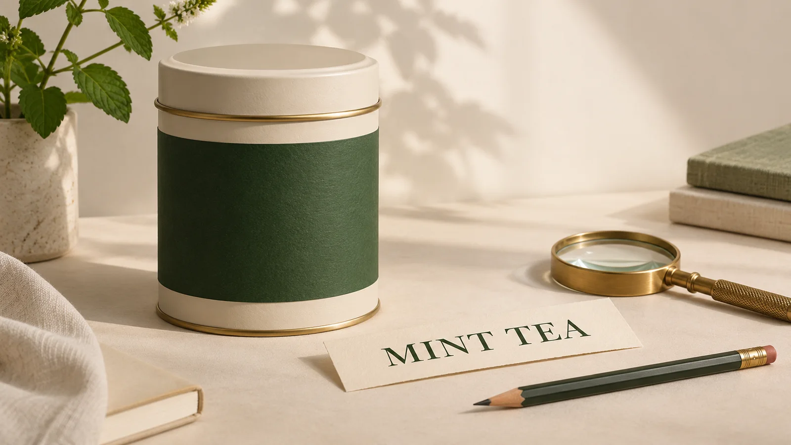
A tea tin looks right in a campaign photograph, but the flavor name needs to change. You want new words on the label, not a different tin, a redesigned brand, or a fresh camera angle.
For Krea 3 text editing, separate the exact copy from the visual instruction. State which line changes, list what must stay, and proof the result against an approved text sheet. Short label edits can be useful for exploring a concept; exact final typography needs its own acceptance check and, when necessary, finishing with approved artwork.
You can prepare a focused image-edit brief in the Krea2 image editing workspace. This guide uses a fictional tea tin to explain that process, including when to stop generating and finish the label in a design editor.
Krea's Krea 3 announcement describes preserving product details and making targeted label updates. Those are developer capability descriptions, not a promise that every letter or unchanged pixel will survive every edit. The prompts below are original examples, and the illustrations are planning concepts rather than model test results.
Decide whether the words belong inside the photograph
A flavor name printed on a tin belongs to the photographed object. A sale headline beside the tin belongs to the campaign layout. Keeping those jobs separate makes revisions easier.
| Text task | Practical route | Acceptance condition |
|---|---|---|
| Explore a short flavor-name change on a label | Try one tightly scoped image edit | Correct words, plausible label surface, unchanged product |
| Add a headline, price, or call to action outside the product | Set editable text in the final layout | Approved copy and readable type at delivery size |
| Reproduce a logo or specific font exactly | Use approved artwork for finishing | The actual artwork and typography match |
| Deliver small print or a machine-readable code | Retain verified production assets | Check against the approved source, not visual plausibility |
For external campaign copy and format changes, use the ad resizing workflow. Here, the narrower task is changing a line already printed on a product in the photo.
1. Make a copy sheet before writing the prompt
Keep the original photograph untouched. Choose a clear view where the label is large enough to read, with no hand or prop covering the target line. A front or gentle three-quarter view is easier to evaluate than a tiny label near the edge of the image.
Our fictional example is a cream tin with a dark green label. The upper line reads MEADOW; the lower line currently reads GREEN TEA. The requested lower line is MINT TEA.
Write the approved text separately:
- Preserve:
MEADOW, uppercase, on the upper line. - Replace:
GREEN TEAwithMINT TEA, uppercase, on the lower line. - Keep: the label boundary, dark green paper, cream lettering, tin geometry, lid, camera angle, background, and existing light.
- Add nothing: no extra slogan, badge, ingredient claim, or decorative lettering.
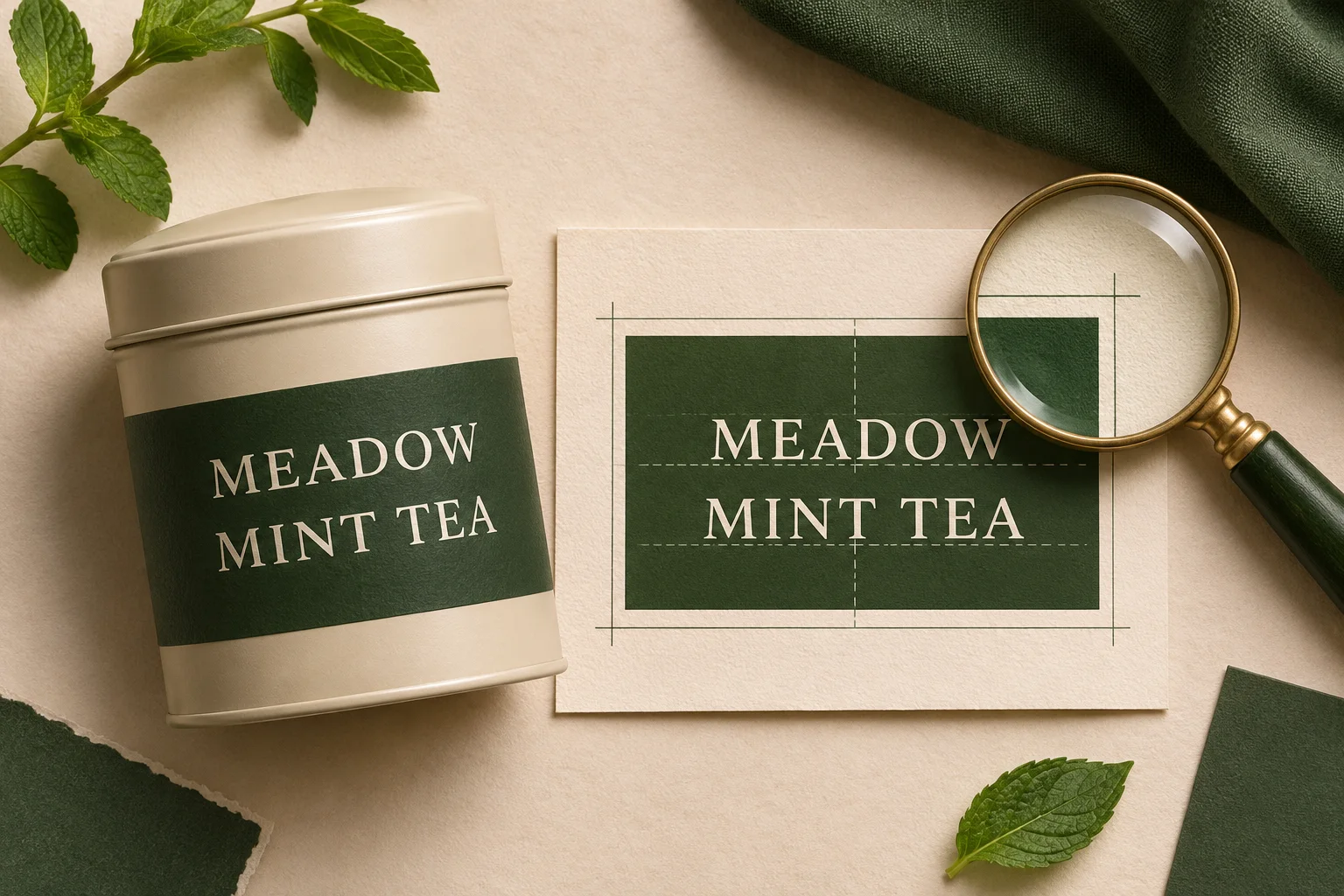
AI-generated editorial illustration of a copy and label-planning brief. It is not a Krea output or a tested before-and-after result.
If a client supplies different casing, punctuation, or an accented word, preserve that specification in the copy sheet. Do not let an image model decide which spelling the brand intended. A picture of a label can guide appearance; the approved text remains the authority for the words.
2. Request one line change
Open the image editing workspace, select Image-to-Image, and upload the source photo. For the first attempt, retain the source composition and choose the model options and output settings currently available. Review the displayed credit requirement before generating.
Start with one source when it clearly defines both the tin and the label. If you add approved artwork as another reference, explain its role: the photo defines the object and lighting; the artwork defines the label content. Do not assume that adding references makes the result exact.
Try this original prompt:
Keep the cream tea tin, lid, camera angle, background, and lighting unchanged. On the dark green front label, replace only the lower line “GREEN TEA” with the exact uppercase text “MINT TEA”. Preserve the upper word “MEADOW”. Keep the cream lettering, existing label boundary, and two-line hierarchy. Make the lower line follow the tin's curved label surface, with spacing appropriate to the new words. Add no other text, symbols, or decorative elements.
Replace the quoted strings and physical description with your own source details. A vague request such as “change the tea label” leaves the name, layout, colors, and packaging open to interpretation. The prompt guide explains the broader method of separating requested changes from preserved details.
3. Proof the words before judging the styling
First read the edited label against the copy sheet, character by character. Do this at full resolution, then again at the size the audience will actually see. A word that looks convincing as a thumbnail may contain a substituted letter, missing space, or extra stroke.
Check the unchanged line too. The edit is not acceptable if the flavor is correct but the brand word has changed. Do not accept a result solely because an automatic text reader reports the expected string; visual inspection still has to catch distorted letterforms and unwanted marks.
Then inspect how the text sits on the object:
| Check | What can go wrong | What a usable result needs |
|---|---|---|
| Exact copy | Missing character, changed case, extra word | Every approved character and space is present |
| Hierarchy | Flavor line competes with the brand word | The intended reading order remains clear |
| Label boundary | Paper patch expands or loses its corners | The original label footprint stays recognizable |
| Curvature and perspective | Letters appear pasted onto a flat plane | Type follows the visible surface consistently |
| Light and surface | Bright letters ignore a shadow or reflection | Lettering belongs to the same lit label surface |
| Product identity | Lid, rim, tin proportions, or finish change | The product still matches the source photograph |
If the target word is tiny in the final ad, preview the full ad rather than only a magnified label. Correct spelling is necessary, but it does not make unreadably small text useful.
4. Give a narrow correction, then use a stopping rule
When only one issue remains, name it. For example, if the output says “MINTTEA”:
Keep the tin and label layout unchanged. Correct only the lower line to read “MINT TEA”, with one clear space between the two words. Preserve “MEADOW” and add no other lettering.
Compare the revision with the original and the copy sheet again. If repeated attempts keep changing the upper word, distorting the label, or inventing small text, stop iterating on that version. More generations do not turn a nearly correct string into approved artwork automatically.
For the tea-tin example, acceptance requires both lines to match the copy sheet, a natural label wrap, and unchanged visible product features. Save the chosen concept separately from the original photo.
Finish exact typography with approved artwork
When the font, logo, spacing, or wording must match precisely, finish with editable type or the supplied label artwork in a design editor. Fit the approved artwork to the label's perspective and curvature, and match its visible lighting. Recheck the edges and surface appearance after compositing.
This finishing step is especially useful when a generated image already has a good composition but the letters are unreliable. If you only need a new environment, keep the approved product asset and develop the surroundings separately; the product backgrounds and lighting guide covers that task.
A concept image does not replace a production packaging file. Keep required small print, barcode artwork, and other exact assets in their verified source files. Use the final photograph to communicate the design, and use the approved artwork to establish what will actually be printed.
Before delivery, retain the source photo, copy sheet, prompt, accepted image, and any finishing file together. Another designer should be able to tell which words changed and which asset approved them. That makes a short text-edit request reviewable from start to finish.
Checked November 3, 2026: developer announcement and the Krea2 editing interface. No image-generation performance benchmark was conducted. Available settings and costs should be checked in the workspace; this guide makes no speed, price, or exact-font guarantee.